Why the same three typefaces are used in nearly every airport
By Chris C., June 13 2014
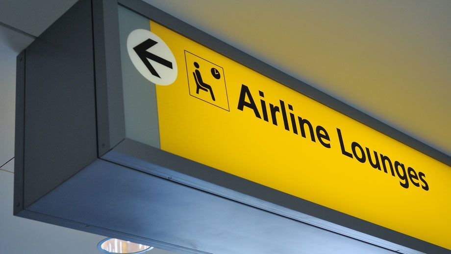
IN BRIEF | Just three typefaces make up the directional signage in 75% of all airports: Helvetica, Frutiger and Clearview.
These three font families are easy to read at a distance – see if you can spot them on your next journey.
Helvetica

Developed in Switzerland, Helvetica supposedly has a ‘neutral’ vibe, making it feel both vaguely familiar and comfortingly classic.
The distinctive lowercase ‘a’ stands apart from an ‘o’ – even from far away – with many other typefaces using a rounder ‘a’.
Frutiger
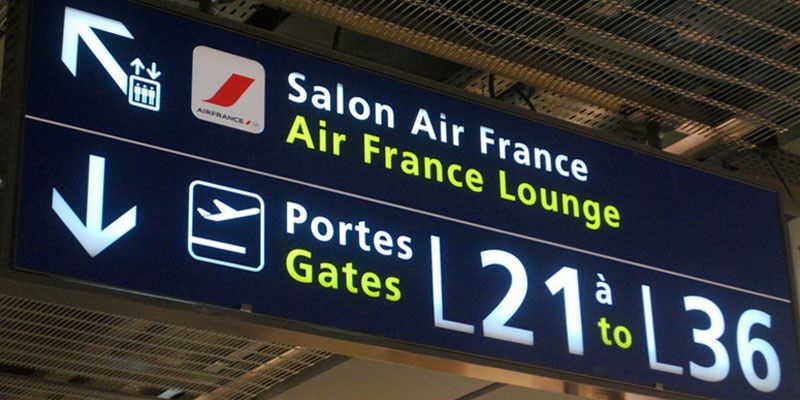
Adrian Frutiger designed the self-titled typeface for the Parisian Charles de Gaulle airport in 1975.
To match the airport’s contemporary architecture, it's characterised by protruding letter stems – particularly those like ‘l’ and ‘p’ – along with wider space for the openings of letters like ‘e’ and ‘n’.
Clearview
Clearview was developed based solely on legibility at a distance, being put to use on the American interstate highway system.
Look for the larger enclosed spaces in letters ‘a’, ‘g’ and ‘e’, and for capital and leading letters that are a little higher than the rest.
Read more: Gizmodo.com
Follow Australian Business Traveller on Twitter: we're @AusBT
Chris is a a former contributor to Executive Traveller.
28 Oct 2011
Total posts 645
clear, simple and similar/familiar worldwide...all elements essential to 'lessen confusion' of travellers as they traverse through various airports/countries :-)
Virgin Australia - Velocity Rewards
19 Feb 2014
Total posts 441
Some departure signs remind me of an A333 landing....
Cathay Pacific - Asia Miles
25 Apr 2013
Total posts 542
Please elaborate?
Qantas - Qantas Frequent Flyer
02 Jul 2011
Total posts 1377
At least its better than the font used in this Sydney Airport related ad
All the three fonts share similar characteristics that improved readability
- thickness, spacing (kerning)
Cathay Pacific - Asia Miles
25 Apr 2013
Total posts 542
How about the ones used in Hong Kong Airport, Taipei Airport and (I think but not sure) Seoul Airport?
Cathay Pacific - Asia Miles
25 Apr 2013
Total posts 542
Sorry, Seoul doesn't have that font. But Beijing does. Do a few more airports have the same font as these three airports, or is it just HKG, PEK and TPE?
Hi Guest, join in the discussion on Why the same three typefaces are used in nearly every airport